Pathways of Light
Wellness Center
Branding, print, & social
Lisa Anne opened Pathways of Light Wellness Center with the goal that collected, like-minded people can create amazing things together when they are aligned with the same purpose and vision. Lisa Anne specializes in astrology, but the center offers many different 'Pathways of Light', all under one roof.
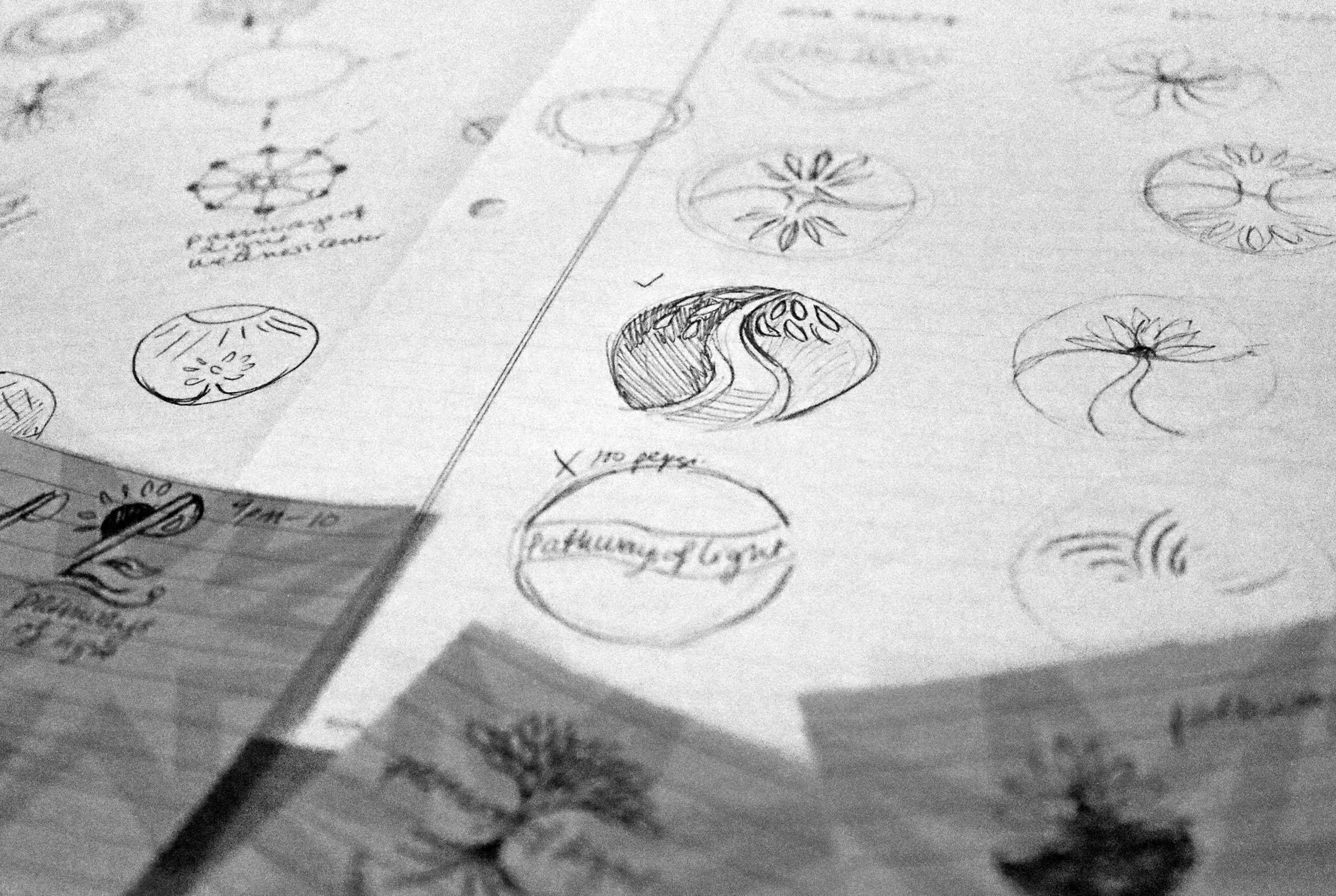
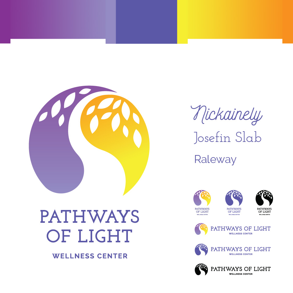
The logo needed to encompass 3 elements: the yin/yang balance, a tree, and a path. The colors reflect the yellow oranges of sunny light and the purple indigos of enlightenment. The majority of the clients Pathways attracts are female and the branding supports this with a soft and graceful look while still retaining professionalism and competence.
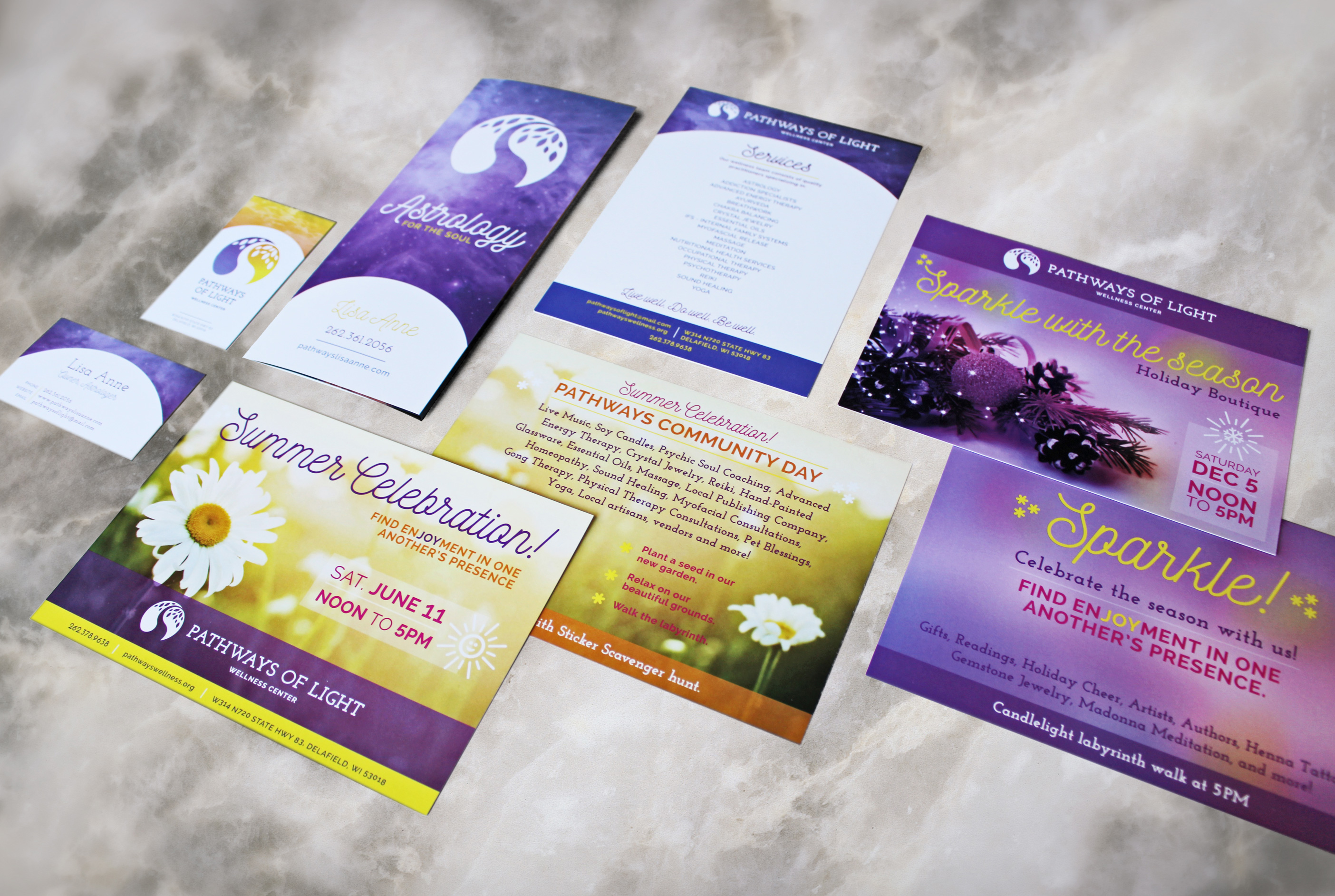
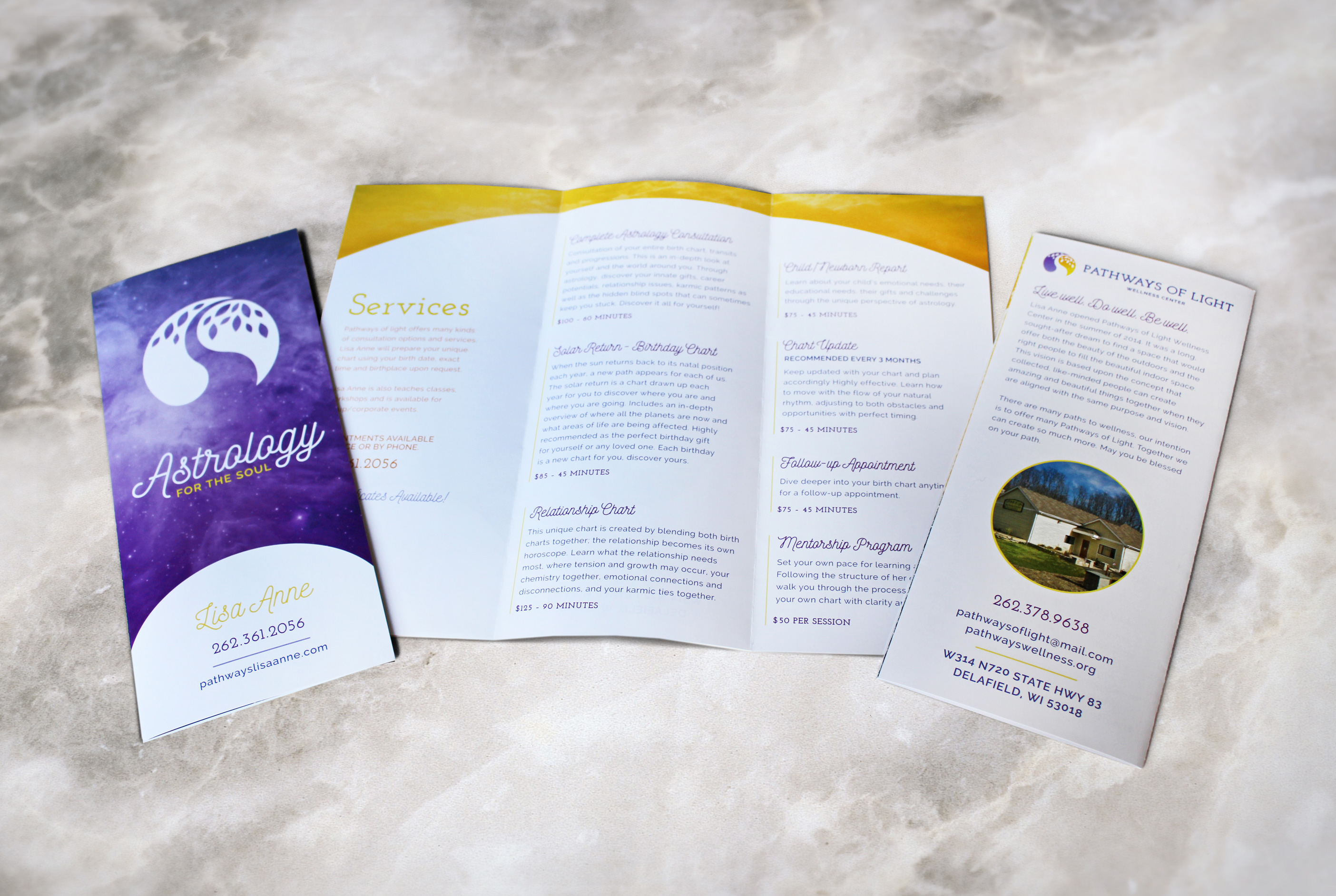
As Art Director for the brand, I’ve been involved since the initial branding phases, from developing a logo to designing stationery, brochures, posters, banners and more.


